Replaced mood boards and wireframes with live code. Five themes, five structural variations, one client vote that took 12 minutes. Site shipped the same week.
Role
Freelance Designer & Developer
Team
Client: kad3dstudio (Gurgaon, NCR)
Duration
1 session
Technologies & Skills
Web DesignVibe CodingNeubrutalismNext.jsFreelanceLanding Page
A client came to us at Kagadmodyaa needing a landing page.
kad3dstudio — a 3D printing and design collaboration studio in Gurgaon, NCR. They work with businesses needing rapid prototypes, architectural scale models, and small-batch production runs: the kind of client who has a concept and needs a physical object in their hands fast. The brief was clear: a landing page that communicates that value, brings in inquiries, and gives them a professional presence to point people to. Nothing technically complex. Standard scope.
Except we decided not to run the standard process.
The Process We Didn't Run
If you've been through a traditional web design engagement, you know how this goes.
Discovery call. Creative brief. Mood boards — usually a PDF with three visual directions and a lot of "imagine what this would look like as a website." Client picks a direction. Wireframes go out (or don't, depending on budget). Revisions. Design sign-off. Handoff to development. More revisions. Another round. Another week.
Start to finish, a simple landing page can take three to four weeks — not because the work is hard, but because the process has so many waiting states built in. You send something. You wait for feedback. You revise. You wait again.
We wanted to find out what happens if you collapse all of that into a single session.
Phase 1: Live Themes Instead of Mood Boards
The traditional mood board sends the client images and asks them to imagine a website. We built the websites instead.
Five of them. Simultaneously. Same content, same brand colors — completely different visual languages.
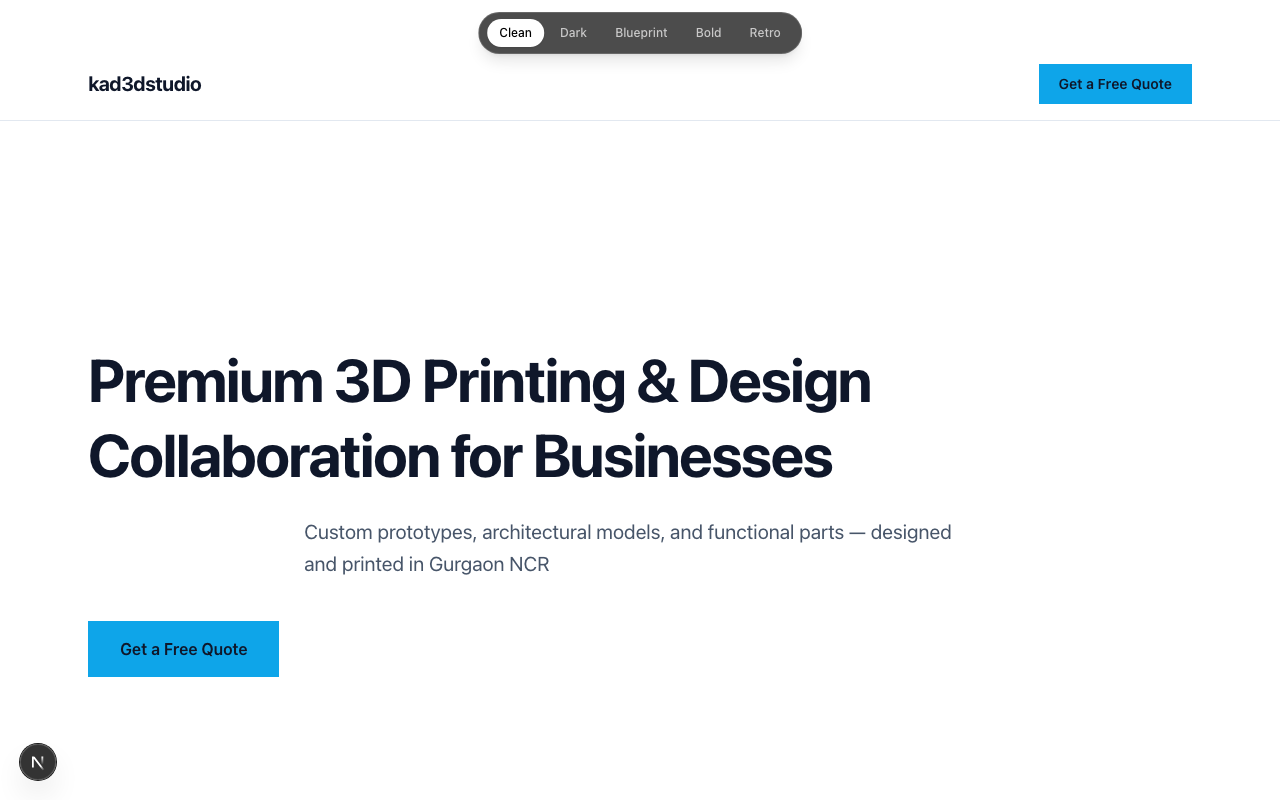
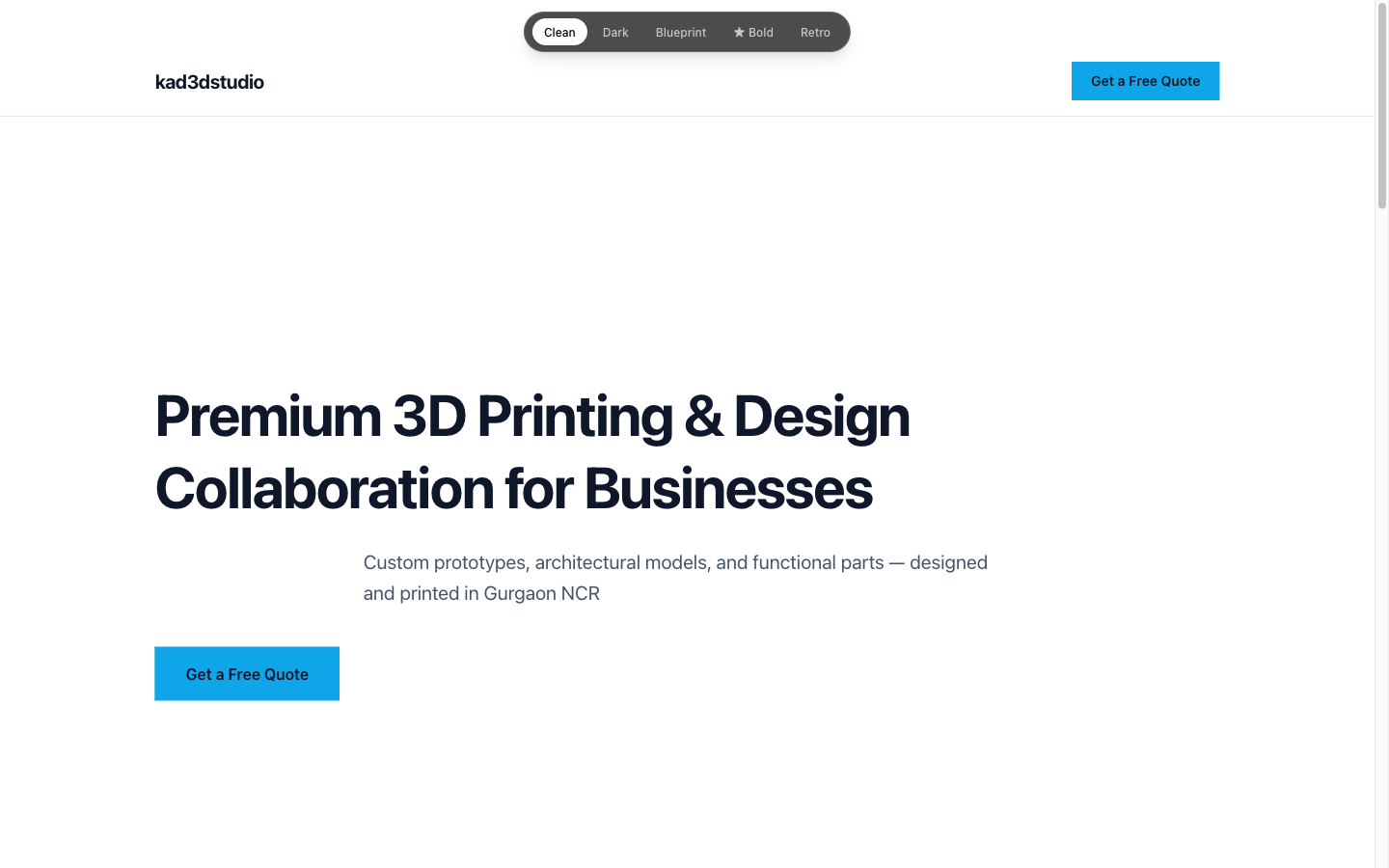
Clean — Swiss minimalism. White space, restrained typography.
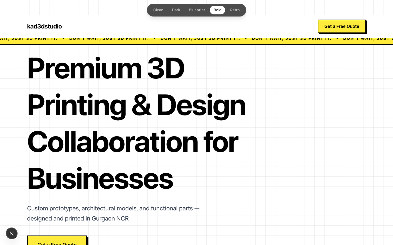
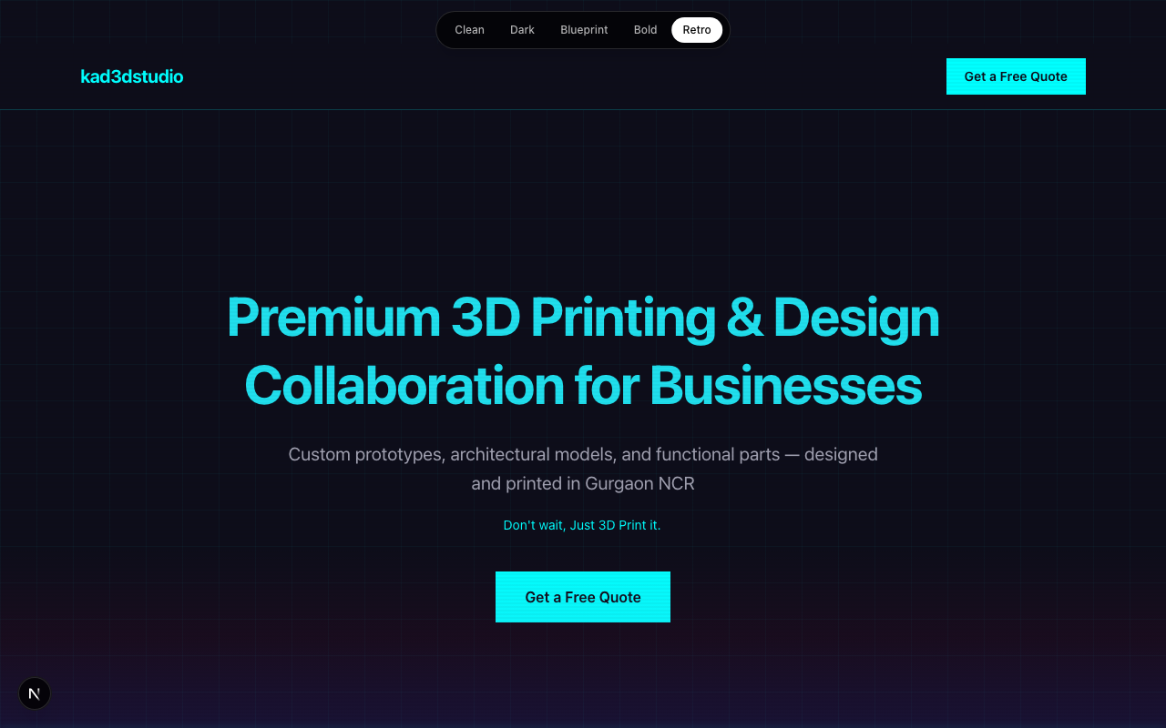
Dark — Industrial tech. Dark backgrounds, orange accents.
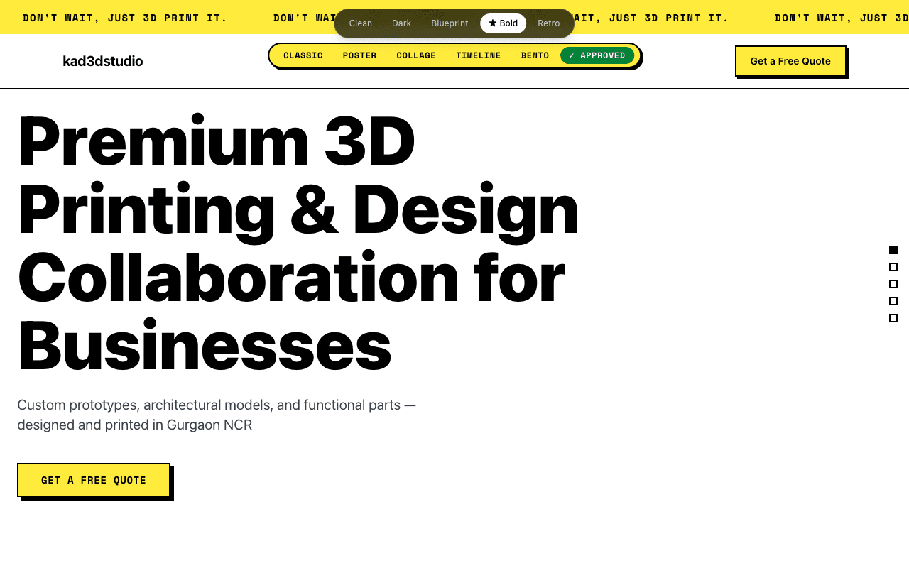
The part that mattered most: a live theme switcher in the top bar. One URL, one codebase, five designs. Click a button — the whole page transforms instantly.
Phase 1: Live theme switcher — five designs, one URL
We didn't send a PDF. We sent a URL.
When the client clicks through themes in a live browser, they're evaluating websites. When they look at mood board images, they're evaluating images. Clients react to a live browser differently than they react to a PDF — the feedback comes faster and it's less hedged.
The Vote That Took 12 Minutes
"We didn't send the client a PDF of mood boards. We sent them a URL. They clicked. They chose. The meeting took 12 minutes."
The client clicked through all five themes together with us on a call. The conversation was immediate.
Bold won. And the reason made sense the moment it was said out loud: neubrutalism is industrial. It's confident. It's physically assertive — which is exactly the feeling you want from a company whose product is a machine that extrudes molten plastic into solid objects. Clean felt too SaaS startup. Dark felt like a cybersecurity firm. Blueprint was compelling but too niche. Retro was fun for about thirty seconds.
Bold fit. Decision made, zero ambiguity, no follow-up Slack thread required.
Phase 2: Structural Variations Instead of Wireframe Iterations
This is where we made a deliberate choice based on a mistake from a previous project.
When you ask an AI to generate "five variations," you typically get the same layout five times with different colors. The sections are in identical positions. The scroll behavior doesn't change. The interaction patterns are identical. Only the palette shifts — which means you haven't actually generated five options, you've generated one option with five paint jobs.
The constraint we added this time: each variation must have a fundamentally different layout, scroll behavior, and interaction pattern. Not color swaps. Different structures entirely.
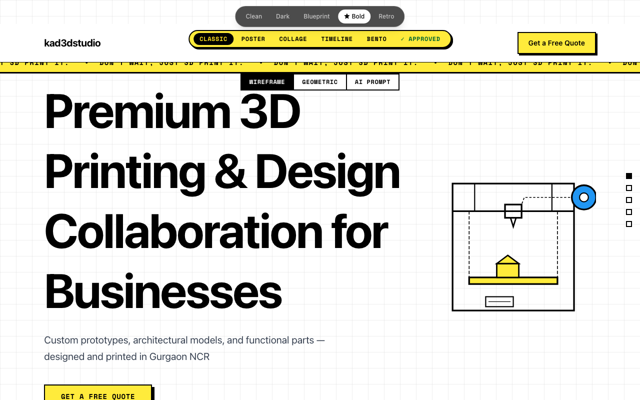
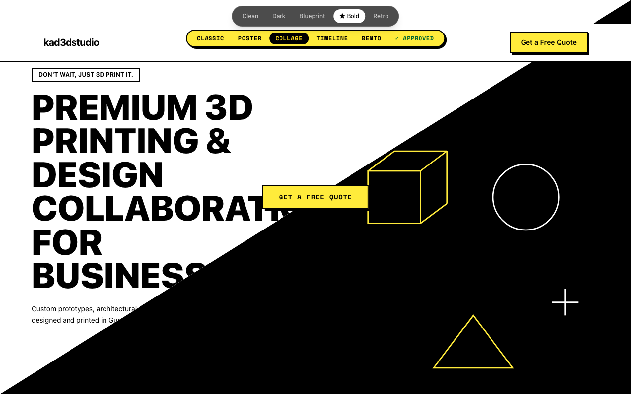
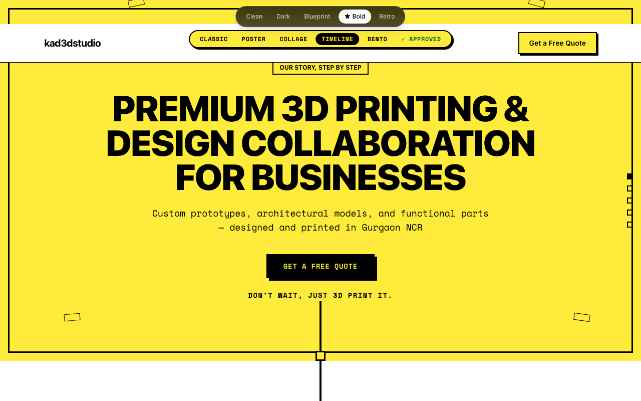
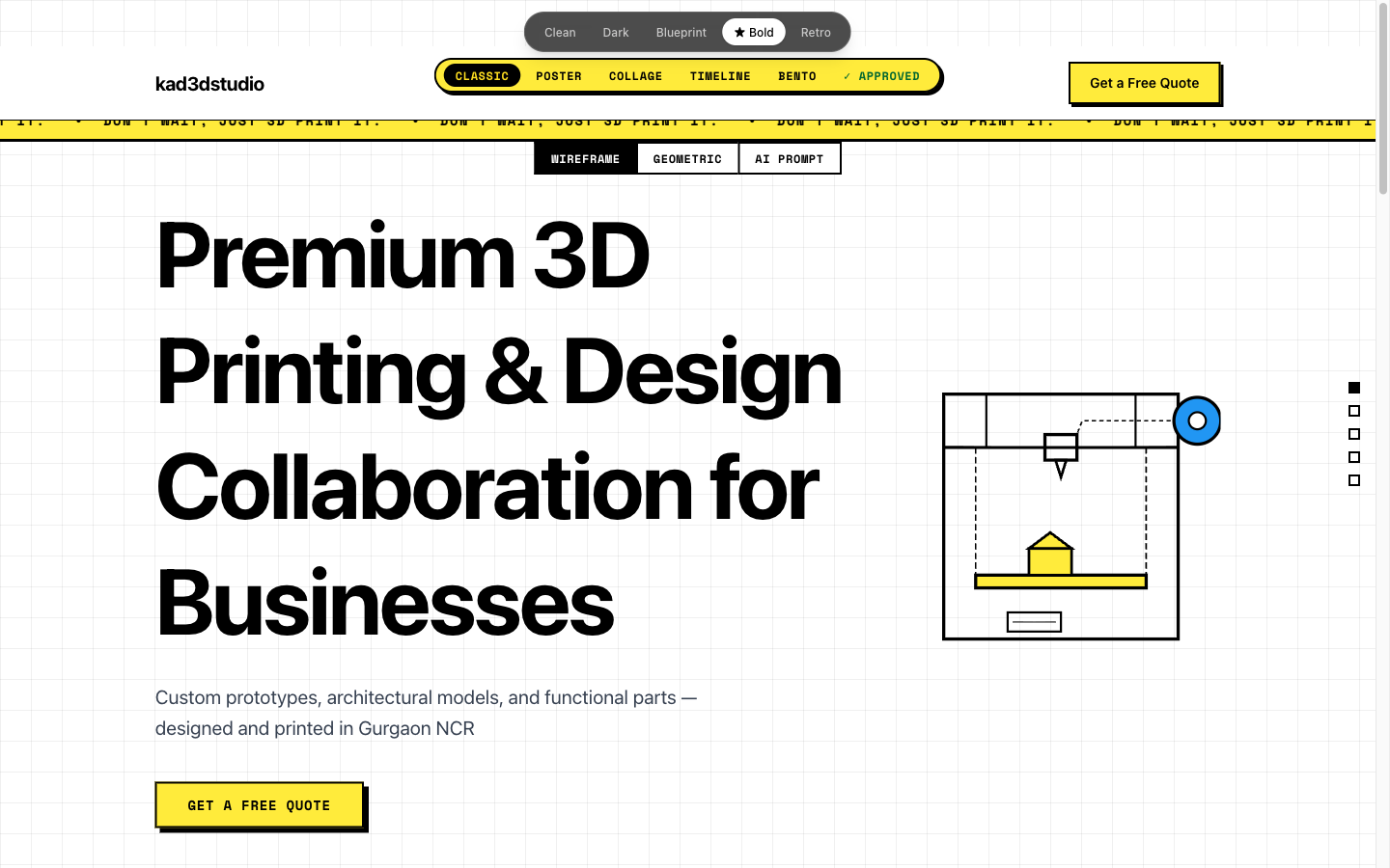
The five Bold variations:
Classic — Traditional vertical stack. Marquee ticker at the top. Sections flow naturally as you scroll.
Poster — Full-viewport sections. Each one fills your screen in a bold solid color as you scroll through.
Collage — Diagonal hero split, scattered post-it note service cards rotated at slight angles, tape decorations.
Timeline — A thick center spine running the full length of the page, content alternating left and right like a comic strip.
Bento — A single-viewport CSS grid dashboard. No scrolling on desktop. Everything visible at once.
Same content. Completely different experiences.
Phase 2: Structural variation walkthrough — same content, five completely different experiences
What the Iteration Actually Looked Like
We used Claude Code to run multiple agents in parallel, each building a different variation simultaneously. What would have taken days of design-revision cycles compressed into a single session.
But we weren't passively accepting whatever appeared. The feedback loop was constant: see → react → describe what worked and what didn't → adjust → repeat.
The post-it note services section from Collage was immediately approved. It felt physical and tactile — right for a company that makes physical things. The dot navigation on the right edge survived every variation too; it made each layout feel deliberate rather than accidental.
Two things got cut fast. Horizontal scrolling required Shift+scroll on most trackpads — nobody does that by accident, and nobody should have to. Scroll-snap felt premium in theory but introduced jitter in practice. We called it "buggy" and pulled it from every variation in one pass.
The constraint that generated the most useful variety wasn't the design constraint. It was being specific about what you don't like. Negative feedback translated into code changes faster than positive feedback.
The Approved Tab
Here's a trick we'll use again on every project like this.
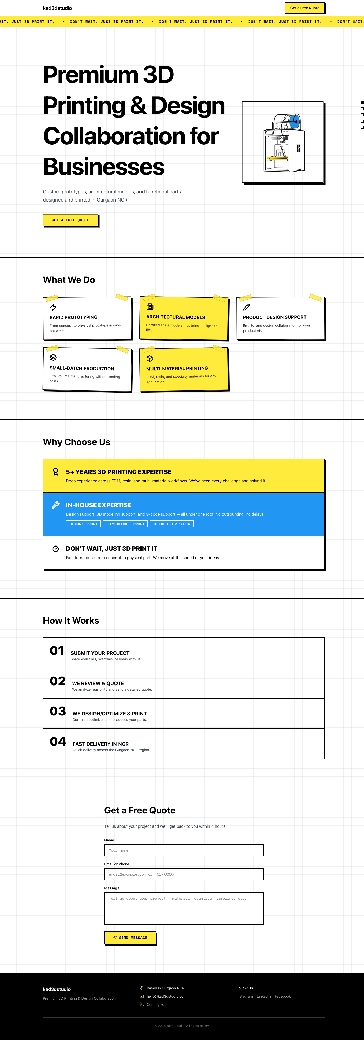
Instead of choosing one variation and losing the parts we liked from the others, we built a seventh option: "✓ Approved" — a live composite page assembling the best section from each variation.
Hero from Classic. Services from Collage (the post-it notes, kept). Process carousel from Poster. Contact form from Collage (there's a tilted card that straightens when you focus the input field). Footer from Collage.
This became the benchmark. New iterations could be compared directly against it. The question shifted from "is this better than the last version?" to "is this better than the best version we've assembled so far?" That's a different question, and it produces better decisions.
No more "I liked the header from version 2 but the services section from version 3" email chains. The client approved sections directly, live, in the browser.
"The switcher is the design process."
Building multiple versions in code and comparing them live is faster and more honest than static mockups that render differently in a real browser.
The Final Result
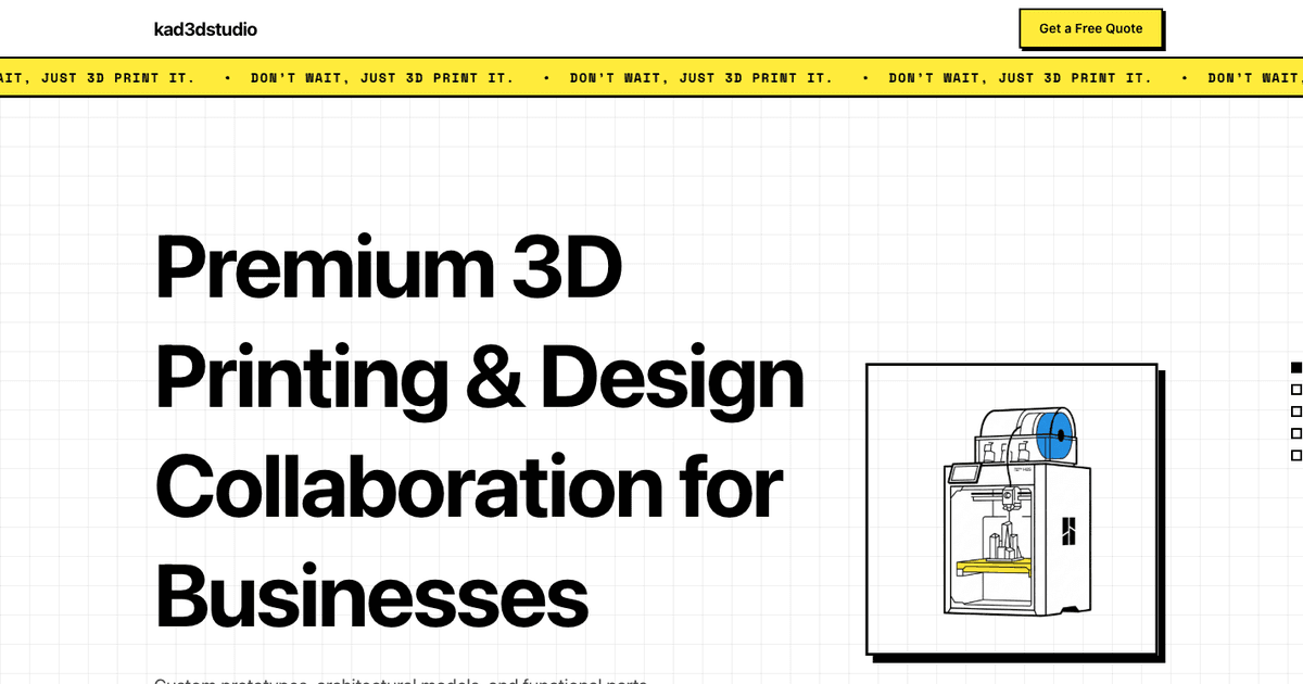
After two rounds of iteration, the team landed on Classic. Clean vertical stack, the marquee ticker running at the top, the post-it service cards, the auto-advancing process section.
The hero needed an illustration. We generated one in Gemini — a neubrutalist 3D printer in black, yellow, and blue, exactly the visual language of the rest of the page. Dropped the PNG in, referenced it in the code, done in under five minutes.
Constraints produce variety, not prompts. The single most important instruction we gave was "fundamentally different layouts, not color swaps." Without that constraint, you get the same page five times. With it, you get five genuinely different websites.
Specificity about what you don't like is more valuable than praise. "The scroll-snap feels glitchy" eliminated that pattern from every variation in one pass. Positive reactions moved slower. Negative ones moved fast.
Ship the comparison, then ship the choice. The theme switcher wasn't just a development tool. It became a client alignment mechanism. Everyone clicked through the same thing at the same time. The vote took twelve minutes. A traditional Figma presentation would have taken three meetings and a Slack thread that nobody fully read.
What This Actually Means for the Design Process
AI didn't make the decisions here. Every judgment call was human. What changed is how long it took to go from "describe it" to "see it."
Traditional design processes wait. You send a deliverable, then you wait for feedback. You revise, then you wait again. A simple landing page drags to three weeks not because the design is hard, but because the process is built around waiting states. The AI collapses that gap. You describe what isn't working, it builds the fix, and you're reacting to the new version before the meeting is over.
We built design, branding, and development in the same session. No handoff from designer to developer. No Figma-to-browser gap where things look different than expected. The client saw exactly what they were approving.
Explore It Yourself
The full iteration showcase — all five themes and all five Bold variations — is live at kad3d-showcase.vercel.app. Click through everything.
If you're thinking about trying this approach with your own clients, the method is transferable. You don't need a large team. You need clear constraints, fast reactions, and the willingness to say precisely what isn't working.