Loading...
UX AuditHeuristic AnalysisMobile AppFintechUser Research
Arya Chanakya
Fintech UX Audit
Arya Chanakya Investment Services hadn't updated their app since 2014. I spent 3 months figuring out exactly what was wrong with it.
RoleUX Consultant
Year2022
Duration3 months

0
Survey Responses
Quantitative research
0
User Interviews
In-depth qualitative sessions
0
Heuristic Violations
Across 4 task flows
0
Critical Issues
Severity 4 — must fix before release
The Client
Arya Chanakya Investment Services
An AMFI-registered mutual fund distributor in Nagpur, in business for 18 years, with 5,000+ clients and over ₹200 Cr in assets under management.
18 yrs
In business
5,000+
Clients across Maharashtra
₹200 Cr+
Assets under management
The name comes from Chanakya — the ancient Indian economist and advisor to Emperor Chandragupta Maurya. Mutual funds make up 83% of their revenue; equity broking, insurance, and fixed deposits cover the rest. Solid business. Strong client relationships. The app told a different story.
The Problem
An app frozen in 2014
Clients trusted the firm completely. The app was a different matter. Most of them were just calling staff instead.
The app hadn't been updated in nearly a decade. Several users told me they were embarrassed to open it in front of anyone. 35% only checked it once a month — a quick balance glance, nothing more. 25% had never used it.
It was built to reduce dependency on staff. What it did was create it. Most users found it easier to pick up the phone than figure out the app.

My Role
Research and audit — no implementation
Research and audit only, no implementation. Three months to produce a clear diagnosis.
What was delivered: 56 surveys and 9 interviews turned into a research report, plus a full heuristic evaluation: 40+ violations documented, each rated 0–4 for severity, with annotated screenshots for every finding.
Why scoped this way: Keeping research and audit separate from build meant the client could act on the findings whenever they were ready — not tied to any particular dev team or budget window.
Process
Two phases, one deliverable
Two phases, back to back. Research first to understand what users were doing and why. Then the heuristic audit to document what was broken.
Phase 01
User Research
- Design brief and scoping call
- Competitive analysis
- 56-response quantitative survey
- 9 in-depth user interviews
- Problem statement and HMW questions
Phase 02
Heuristic Audit
- 4 task flows evaluated end-to-end
- Nielsen’s 10 heuristics as the framework
- 40+ violations documented
- Severity scale 0–4 applied to every finding
- Annotated audit report as the final deliverable
User Research
56 voices, one broken experience
56 responses to a structured survey. It showed which parts of the app were losing users — and confirmed how many had quietly stopped trying.
Top confusing features
SIP Performance Report39%
Dashboard / My Holdings31%
Fund Picks28%
Login / Sign Up22%
Purchasing Mutual Funds22%
Usage patterns
34%
Open it once a month
Just a quick balance check
25%
Had never used the app
Completely off the table
16%
Open it but don’t invest
Passive, not active users
User Interviews
9 conversations, 10 patterns
Nine interviews, spread across age groups and comfort levels with tech. Time-poor professionals, financially cautious investors, and retired users who rarely opened the app.
Trust is high, but the app erodes it
Every interviewee trusts Arya Chanakya as a firm. None of them trust the app. Several said they were embarrassed to show it to family.
Individual investment data is buried
The data is there — but no one could find their personal investment performance without calling the office first.
Financial jargon is a wall
Scheme fact sheets and technical terms appear with no context. Most users couldn’t make sense of them and didn’t bother trying.
Navigation is a maze
Most users didn’t know the app had other pages. Nothing in the UI suggests there’s more to explore.
Visually outdated
"Boring and uninteresting." Several users brought up Groww and ET Money on their own and said they’d rather not open the AC app in public.
Transaction history is invisible
There’s a transaction history in the app. None of the nine people I spoke with had ever found it.
No cross-platform portfolio view
Groww shows you everything you own across every broker. Arya Chanakya only shows what you hold with them.
Security signals are missing
Every single interviewee expected some kind of visible trust signal on an app handling their savings. The app has none.
24/7 access gap
The only way to check your portfolio was to call the office during working hours. That’s not what anyone expects from a mobile app in 2022.
The app requires human support to use
Most users called Arya Chanakya’s team for things they should have been able to do themselves. The app had turned into a reason to call, not a reason not to.
Heuristic Evaluation
Nielsen's 10 heuristics, applied
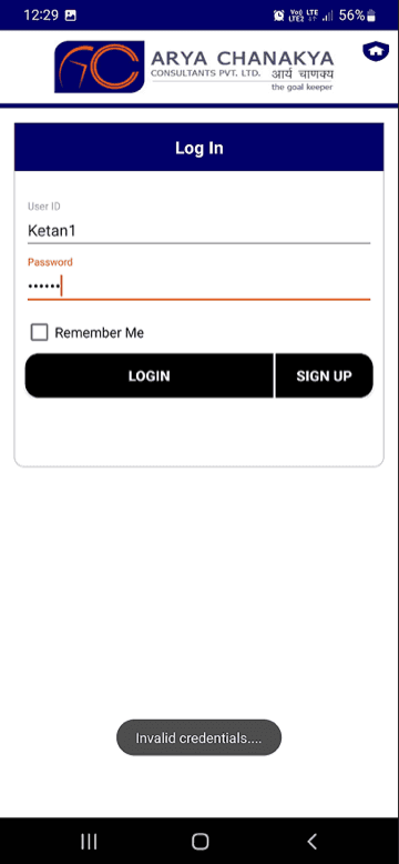
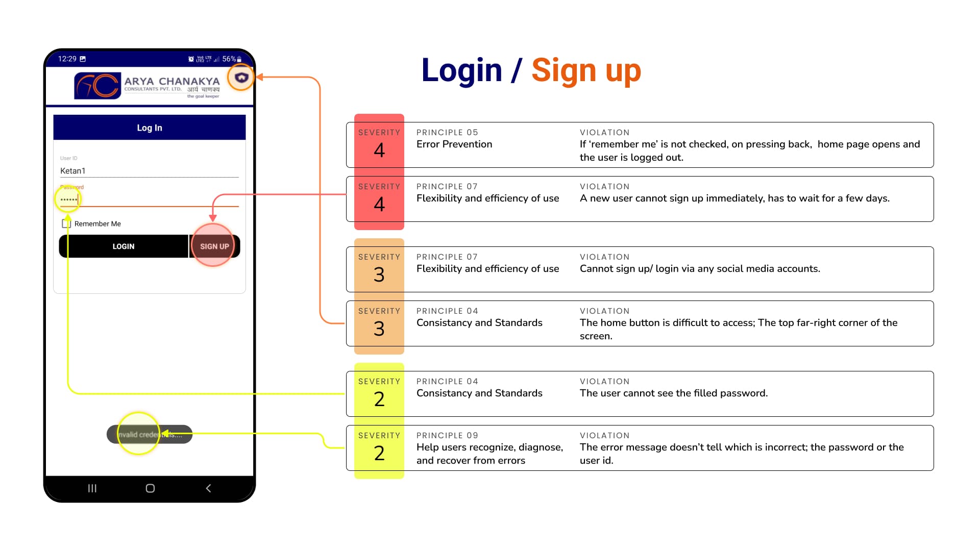
The main deliverable. The existing app evaluated against Jakob Nielsen's 10 Usability Heuristics, end to end — covering the task flow a real user would attempt.
Evaluated task flow
Sign Up /
Login
Login
Homepage
Top SIP Schemes
Top Schemes
Check SIP
Performance Report
Performance Report
23
Critical issues
Severity 4 — must fix before release
9
Major issues
Severity 3 — high priority
8+
Minor issues
Severity 0–2 — low priority
Nielsen's 10 heuristics
Keep users informed about what is going on through appropriate feedback within a reasonable amount of time.
Screen-by-screen breakdown


Reflection
What this engagement taught me
📦
What I delivered
56 surveys and 9 interviews turned into a research report. A heuristic evaluation covering 40+ violations, each rated against Nielsen’s 10 heuristics, with annotated screenshots for every finding.
🎯
Scope as a design decision
Scoping this as research and audit, not build, was deliberate. The client got something they could act on immediately, regardless of when they chose to move on implementation. The findings would not go stale waiting for budget or a dev team.
💡
Designing for unfamiliar users
This engagement changed how I think about research. Working with people in their 40s and 50s in Nagpur, some barely using smartphones, made it obvious how many design assumptions do not apply. Trust signals, plain language, showing less at once: these matter more than any feature Groww has. I still think about this one when I am tempted to design for myself.
Want to work together?
Available for UX research, design audits, and product strategy engagements.